
71·
2 months agoTo me, that’s even worse. Ligatures that have 0 separation where it’s expected short circuit my reading comprehension.


To me, that’s even worse. Ligatures that have 0 separation where it’s expected short circuit my reading comprehension.


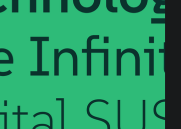
The “fi” combination also seems problematic since they seem to intersect.


Similar functionality is actually baked into the kernel!
Good ol’ hanlon’s razor.


Don’t worry, George Kurtz (crowdstrike CEO) is unavailable today. He’s got racing to do #04 https://www.gt-world-challenge-america.com/event/95/virginia-international-raceway
Username checks out!
So what I see there is that badly designed fonts require ligatures to correct interactions.
Like, I get that there are some neat ones, e.g. I have them turned on when writing code for symbols, but they seem wholly unnecessary and distracting in alphabetical characters.
But I’m also the kind of weirdo that thinks the world needs more monospace fonts.
/shrug